The use of smartphones is constantly growing the world over. But, most businesses are still not realizing this significant reality. An adaptable, responsive website design is the ideal approach to improve your site’s user experience and make your product or service more accessible to everyone.
As a business or website owner, you must be excited to read about responsive website design benefits. But, before we continue, we must define responsiveness.
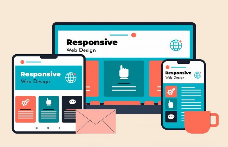
What Is “Responsive Web Design”?
A responsive web design (RWD) involves creating web pages that work very effectively and efficiently on multiple devices and screen sizes. So, web designers associated with the top website designing company in Delhi endeavor to render a website experience that supports the multiple ways users access and engage with websites. Needless to say, mobile traffic makes up about half of worldwide online traffic. This implies businesses must make their websites accessible and easy to use on small screens like tablets and smartphones.
Some of the salient benefits of a responsive web design
Responsive web design benefits businesses and, most importantly, users in the given below ways:
-
More traffic
In 2022, mobile devices accounted for over half of top U.S. website traffic, according to SimilarWeb. Thus, companies must build websites that appear effectively on smaller screens to avoid distorted graphics and poor site architecture. Although some organizations still have a mobile-specific website, responsive design is becoming the norm due to its higher versatility and adaptability.
-
Faster and cost-effective mobile development
Creating a responsive web design for any website design company in India is far faster than creating a separate mobile site from a desktop website. Since time is money, responsive design saves a lot of it. A responsively designed website may cost more than two distinct websites, but you’ll save money in the long run owing to maintenance, specific configuration, etc.
-
Lower maintenance needs
A separate mobile site necessitates more testing and support. However, a responsive design uses standardized testing methods to ensure an appropriate layout on every device. Having separate desktop and mobile sites requires two content strategies, administrative interfaces, and possibly two design teams. The “one size fits all” approach of responsive design reduces developer, business owner, and consumer stress. Less maintenance time means more time for marketing and content production.
-
Faster page speed
Mobile consumers have limited attention spans. Studies suggest that mobile visitors quit websites that take more than three seconds to load. An unoptimized site for smartphones and tablets can take longer to navigate, which can drive customers away. Your responsive website will load faster if it implements modern performance techniques like caching and responsive image display.
-
Lower bounce rates
A responsive and optimized mobile site improves user experience and reduces bounce rates. Consequently, users are more inclined to stay longer and browse your site. If your site isn’t responsive, visitors are less likely to stay and more likely to bounce.
-
Improved conversion rates
Reducing bounce rates is only half the battle. Converting new customers requires a consistent user experience across devices. Redirecting consumers to device-specific websites slows the subscription process. Having a single, secure, and professional website on all platforms reduces user frustration.
-
Easier analytics reporting
Easy analytics reporting enables informed website modifications by identifying traffic sources and user interactions. Businesses must track users’ conversion routes, funnels, and redirection for numerous website versions. Monitoring is much easier with one responsive site. Google Analytics and other tools now combine monitoring and analytics into a single report for responsive websites so you can understand how the content performs across devices.
-
Better SEO
Search engine optimization now prioritizes responsive web design created by the top website design company in India as much as quality content. Better backlinks and lower bounce rates boost search ranks, but mobile-optimized sites provide an extra SEO benefit.
-
Enhance online browsing experience
Ensuring a strong initial impression on both desktop and mobile devices is crucial for your website. If visitors have to zoom, shrink, and pinch their screens on their first visit, they may leave and try another website.
-
Improved offline browsing experience
Now that many smartphones and tablets support HTML5, responsive site design created by the best website designing company in Delhi enhances the offline browsing experience.
Concluding Remarks
People are accessing the web through virtual reality headgear, and smartphones have enabled the invention of new applications like augmented reality games, so there will be plenty of new hurdles. So, developers need to focus on lower maintenance costs, SEO, and conversion rates. The latest responsive design advances have concentrated on smaller screens, and this trend is not going to slow down.